Here is a small update about what will be coming soon:
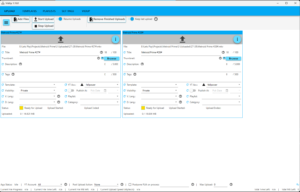
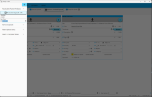
VidUp got a little „facelift“, I threw out the ribbon menu and replaced it with the material design controls. The inconsistent look dates back to the early days, I first made the menu with Office like ribbons, but the upload and template controls looked pretty shabby with them, so I took the more modern material controls in Google style instead, which would also be potentially better mobile app capable. Between then and now, I had repeatedly toyed with the idea of getting rid of the ribbons, but I couldn’t think of a good way of accommodating all the buttons and boxes with the larger material controls. Actually, this only concerned the upload ribbon, because it has acquired an extensive menu in the course of time. I think I have now found a good approach with a side menu, which also streamlines the bar at the top and makes it clearer, I have only leftthe functions that I think you really need every day:
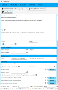
I also put some thought into automation and started putting that in:
I’m sure it’ll take another 2-3 weeks before the new release comes out.


